Thursday, 17 December 2009

Front Cover Draft 03


This is my front cover so far

I am very pleased with how I adapted conventions to appeal to my target audience (such as the use of the colour scheme of red black and white).

Also, the model being on the right, yet still cover part of the masthead, follows convention and allows for a better magazine layout.

I have included ideology information near the bar code (the website of the magazine).

There is also a special offer of Free Badges, which would appeal to my target audience, as small badges are somewhat of a fashion statement.

I am very pleased with how this turned out and will discuss it in further detail in the evaluation.

After reviewing the front cover, it seems evident that there are several changes I will have to make to it:

  • I will remove the shadow from the photograph, to give the magazine a more professional and less 'cheap' feel to it

  • I will change the fonts in the small advertisement for free badges, and in the footer, so that they fit in more with the image of my magazine

  • I will put a shadow effect on the badge to make it look more aesthetically pleasing (which will hopefully be the outcome when coupled with the change in font)

  • I will change the background colour, as the current background is slightly discoloured and lacks the professional feel I wish my magazine to have. Photographically, it also has quite a bit of 'noise' on the background, which gives the magazine a cheap look, which I wish to get rid of

  • I also will change the colours on the 'Blue Dawn' cover line so that it stands out more. I will probably change it to a colour which, while breaking the red/white/black convention, keeps up the bands image and also stands out on the page

Front Cover Draft 02


This is a draft/mock-up I made of the front cover.

There is alot I will need to change, such as the placement of the main image, which in my opinion limits the layout of the front cover (such as placement of the main cover line and the normal cover line).

I iwll consider these aspects while making my final front cover

Double Page Spread Draft 01


This is the hand drawn draft of my double page spread.

Contents Page Draft 01


This is the hand drawn draft of my contents page.

Front Cover Draft 01


This is the hand-drawn draft for my front cover.

Wednesday, 16 December 2009

'Enter Oblivion' Photographs:


I took several mid shots of the model, for use on the front cover and/or contents page to advertise the article, but my favourite image of these is the one I intend to use on the double page spread where the male model is leaning against the wall.

I used, like intended, a white-walled corridor-like area, though may edit some of the background out to make the double page spread look better (i.e. make it a better, more even colour).

I also experimented with some different lighting techniques (some of which didn't work, as seen by the photo in which half is in shadow).

'Hyperbolic Dandyism' Photographs:


As you can see, the photographs I took were of a single male model against a white background, as I planned.

I believe he fits the image of the band well (through use of props - i.e. clothing, and hair and also the expression of his face).

Some of the shots are at a low angle to connote that he is more important than others, and he is always giving eye contact to the camera (a convention of music magazine front covers).

I used medium close ups and mid shots, as I believe these will offer the best model placement for the front cover.

The stance of the model is also very confident (which is also a convention when regarding representation).

'Blue Dawn' Photographs:


There are the images I took for the band 'Blue Dawn':
As you can see I took them outside in a natural environment and the male is wearing fashionable winter clothes, and the female is wearing fashionable clothes but not specifically winter to reflect the fact that in the band she is more a 'free spirit'. I believe this prop consideration is successful in doing that.

When putting them in the magazine I will edit out the backgrounds and have them against the colour of the page.

I also used each band member at either side on each image, so that I could possibly incorporate the image in to the contents page being split up into the features and regulars sections.

General photographs:


I only took one photograph of general music related props, due to what I could get a hold of.

I used the macro camera setting, a white background and due to the setting I didn't use a flash so had to find a suitably bright area to take the photograph.

This was the result.

I will probably use this image on the contents, near the sub heading stating that the specific article is perhaps a review of the headphones.

As they are plain black with the skull design on them, they fit in well with the rock-music influenced image of the magazine.

Planning for Photographs

General:
  • I want to take pictures of some items which are generally related to music magazines.
  • Props such as headphones, musical instruments will suffice.
  • I will need to collect the items I would like, and find a place with the correct lighting to take the photos in macro mode (so they are close up, and correct lighting needed because flash photography doesn't go well with macro-shots).
  • I also need a white background to make editing the photographs easier, and because I want the composition to be correct.
  • Therefore I will need to find a suitable place.
Blue Dawn Photographs:
  • To suit the bands image I will take the photos outside, so that they have a more natural composition.
  • I would like the two band members (one male and one female) to wear fashionable clothes associated with the current winter season to suit their image and preferably, clothes with natural colour schemes (like browns, greys,) to once more, suit the image of the band.
  • Due to the way I would like the photos in the magazine, I will photo shop the subject away from the background, therefore the background of the initial photographs will not matter (which is good as this allows for a more diverse composition).
Hyperbolic Dandyism Photographs:
  • As the image of the lead singer will be the main image of the front cover he (he is male as it is more conventional of the music genre and music magazines in general) will be shown as 'cool' by the standards of the audience. His clothes will be a black t-shirt with blue jeans, and his hair will be styled in a way suited to his band's image (similar to the 'emo' style).
  • Due to it being on the front cover, and the possibility that I will edit the background to something like a gradient to suit the image, I am going to take the photographs against a white background. This will also give them a more professional feel, as I will use my college's photography studio for the correct background/lighting/composition.
  • I will experiment with Medium close ups and mid shots for the desired positioning of the model for the front cover.
Enter Oblivion Photographs:
  • The model will be similar to that of Hyperbolic Dandyism (male, black t-shirt/blue jeans,) though I would like to have the model pose as if thinking, or in deep thought.
  • As it will be on the double page spread, the background will be predominantly white, and blank (so that text and other images can be fit on the page). I also want the image to be mainly focused on the musician, as the article contained will be very personal (so it focuses on t e face to bring it to a personal level).
  • The background of this photo (due to the want for the model to be leaning against the wall,) will not be plain white like the lead singer of Hyperbolic Dandyism, but it will be in a plain white corridor hopefully, so that the text can be fit on the page, but it is evident that the model is against a wall.

Masthead Designs


These are the three designs I created for my masthead. The font I used is called "More Than Human" and can be found at www.dafont.com.

I like the font as, with the modern look and sharp points towards the bottom, I believe it is useful at conveying the ideology of the magazine.

The colour scheme of all three (including the white background between the word spaces), all follow the conventional colour scheme of red, black and white.

The colours on all three of them combine well, in my opinion, and also helped by the font give the masthead a look which compliments the different aspects of the magazine (such as the individualistic ideology).

Were the magazine to run full-time, all three of these masthead colour schemes would be used overtime, but due to the nature of the course, I will use only one of them.

Featured Bands

In my magazine I have decided to feature three main artists, one of which will dominate each aspect I am making of the magazine, the genre of music they make will be reflective of the ideology of 'Freak.' magazine.
  • Front Cover - Lead singer of 'Hyperbolic Dandyism' - A band whose music is very upbeat, heavy and erratic rock music.
  • Contents Page - 'Blue Dawn' - a two piece neo-folk-rock group, who make in-depth rock music with a natural sound and traditional instruments. (this group will dominate the main image of the contents page, in a similar way to the picture in the contents page analysis 02 post).
  • Double Page Spread - 'Enter Oblivion' - an alternative industrial rock solo artist who makes heavy rock music with a dance twist.
Each of these bands will be represented in the way which will try to embody their music. They will obviously also feature in other elements of the magazine (i.e. on the contents page)

Magazine Title

  • I have decided to call the magazine "Freak"
  • This is because it is short, snappy, easy to remember and it also is reflective of the ideology and the target audience of my magazine.
  • This is because the audience are very individualistic, and a 'freak' is something which goes against the norms of society, like the target audience. It reflects the ideology because the genres of music and general content are all unconventional in nature, but that is what makes them appealing to their target audience.

Sunday, 13 December 2009

Moodboard


This is the mood board I made to compile ideas about my music magazine.

As you can see i have used the colour scheme of red, black and white (a convention of music magazines) and I would like to incorporate this colour scheme in to my front cover.

I also put down excerpts of an article, logos and mastheads and pictures of music related objects (i.e. magazines and headphones) and different designs which would suit the image of the magazine.

Friday, 11 December 2009

Genre

After performing research and considering the Target Audience at which I wish to aim my magazine, I have decided that the musical genres covered will be the more alternative ones.

These include:
  • Rock
  • Metal
  • Gothic
  • Industrial
  • Electronica
  • Symphonic Metal
  • Indie
  • Many more alternative, lesser known genres which would appeal to the target audience (such as Dark Gothic Cabaret, Dance-Metal, Folk-Metal).
  • And many combinations of the already named genres (i.e. Gothic Metal).

These genres are just a few examples of the sort of music my magazine will include. There will, naturally, be a lot more featured were the magazine to run through a lon period of time.

Wednesday, 9 December 2009

Target Market

Practically ALL of the Music Magazine I have looked at in my textual analysis have been aimed at a younger audience.

Therefore, (as these magazines are aimed at the audience and are very successful, as the specific audience like the music magazines) I would like to aim my magazine at a similar audience, preferably 16/17 year old people, up to people in their early twenties.

This will allow me to keep the musical genre(s) my magazine will be based on modern and innovative and less conventional, as that is what people in that age range like - individualism.

I will also be able to give the magazine a fresh and modern image which will appeal to the younger audience.

Also, the content of the magazine will be representative of the audience (for example, I could include a section relating to the fashion of the music scene, as a persons image is very important to people of that age range).

I will use the traditional Media Language (such as the Masthead, Main Image (rest of the main aspects listed in the Conventions and mind map posts...) in such a way that it appeals to the audience by using modern-looking fonts for example.

As my chosen audience is very diverse (there are a lot of different types of people with different lifestyles and tastes) I could give the magazine a very broad content range, making it to appeal to a lot of people, but as this may put people in the target market off when considering buying the magazine (if someone doesn't like a main feature they may not buy it) I may have to restrict the range as a whole.

Also, a lot of my target market are interested in the more alternative types of music (such as rock, metal, even some sub-genres such as industrial rock (heavy rock, almost metal at times with dance elements and vice versa).

This means that in my magazine I will feature these more alternative genres and to attract the widest audience, It would probably be best for me to have the main features in the magazines (therefore the subject of the main image and main cover line, possibly even the main double page spread,) about bands/musical acts in those genres who are particularly successful.

So that many more people in the alternative market are catered for, I will also feature lesser known bands, so that there will be a wider range of people whose tastes are covered in the magazine.

Double Page Spread Textual Analysis 03


[Image scanned from: August 2008 Issue #112 of Rock Sound Magazine]

  • This double page spread is very different from the others in the fact that three quarters of the page (when moving left to right horizontally,) are dominated by the main image.
  • This image is very alternative on the ideology. The band members are wearing white and covered in what appears to be blood, which puts across quite an horrific image and represents how the band are 'different' and 'against the norms'. The picture is at a slightly high angle which is probably to further emphasise how the band (called 'Racebannon'), are different and not conventional of music (as a high angle shots are not often used in representing bands) and none of the models are giving eye contact to the camera. There is nothing particularly notable in the mise-en-scene except for the white walls, overalls, and masses of 'blood'.
  • The final vertical quarter consists of the article which is presented in a very linear manner
  • The masthead and drop cap ('W') are in a font which seems quite industrial and mechanical (possibly hinting that the genre of music the band play is 'industrial metal').
  • The article itself would be quite plain, conventional and boring if it were not for the fact that most of the page is taken over by the bright, bold image.
  • There is also, in very small typeface a caption on the image, which is a humorous quip which adds a more light-hearted side to the page.
  • The institution and page number are shown in the footer, like with the other two double page spreads, and ignoring the larger size of the image, the page is quite conventional in the fact that the main body of the article is on the right hand side.
  • In the top corners there are smaller headlines stating that this is the 'Exposure' regular feature of the magazine. They are bright yellow which isn't a conventional music magazine colour, and the break from convention really helps them stand out on the page, helping them overall.

Double Page Spread Textual Analysis 02


[Image scanned from August 2008 Issue #112 of Rock Sound Magazine]

  • Similar to the first, this double page spread has the headline and a small description of/introduction to the article on the left hand side, and the main article on the right hand side.

  • The font colour is also white which stands out against the blue background of the image.

  • Unlike the first double page spread, the writing on the page is placed around the models of the main image, which gives the page a more dynamic appearance.

  • The mise-en-scene is quite natural and summery, int he fact that the main part of the image is of the blue sky and all of the models are wearing bright, summery-looking clothes. They also appear to be in some sort of park (evident by the bench at the bottom of the photograph).

  • The models are all jumping up in the air, and looking happy and like they are having fun, which compliments the ideology and 'happy' image of the band. They are also photographed at a very low angle, which is making them seem very confident and complimenting their apparent happiness.

  • To attract reader attention the article has a drop cap, which is where the start of the article (in this case, the letter A,) is made to be larger than the rest of the article so that it stands out and reader attention is drawn to it.

  • The ideology of the magazine is shown by the inclusion of the magazine's name and logo in the footer, (which also shows the page number), and this is a very conventional part of the double page spread.

Double Page Spread Textual Analysis 01


[Image scanned from August 2009 Issue #112 of Rock Sound Magazine]

This is a double page spread from Rock Sound Magazine.
  • The main image has two individuals who are wearing clothes and have props which are seen as cool by the people who like their music (black clothes, large sunglasses). One individual is on each page and I believe this is good as aesthetically, it balances the page out.

  • The left hand side is dominated by the headline which is in a white font which stands out well against the natural darkness of the image. This is both aesthetically pleasing and an effective consideration of layout and images.

  • The props and location of the image, when put together with the text font and general feel and look of the image has a very Rural American, almost 'Wild Western' feel about it. Both men are wearing black with black sunglasses which compliments the alternative image of their band and also (coupled with the feel of Rural America,) portrays a very masculine feel. The image is also taken in Sepia, which helps further the 'American' feel it upholds.

  • The mise-en-scene of the image is also very 'western' in the fact it is in a building which looks like a Western Saloon almost. The models are also pictured at a slightly low angle making them seem more confident and bettering them.

  • Only one of the men appears to be giving eye contact, and even then it only appears that way, as we are unsure due to the sunglasses he is wearing. This adds the bands image, as it makes them appear mysterious and more 'cool' in the eyes of their target audience.

  • The right hand side of the article is mainly dominated by the article. The font, like the headline, is white, and stands out against the dark image.

  • The article is in columns and paragraphs (very conventional) but divided in the middle by a large quote from the article, made by one of the band members. This both looks good, and aids the reader as it divides up the article making it seem like less text so the the readers are more likely to read it through.

Contents Page Textual Analysis 03


[Image scanned in, taken from the August 2008 Issue #112 of Rock Sound Magazine]

This contents page is the second half of the one I analysed in the previous post. As shown by the small headline in white text on the black box, this half of the contents page will show the 'regular' features of the magazine, unlike the previous one.
  • This part of the contents pages is a lot more reminiscent of the conventional contents pages we are used to seeing. There are features such as a letter from the editor, in-depth information about the institution (such as the location and staffing credits,) images presented in a more conventional way (several smaller ones) and even a page-numbered article list.
  • The 3 images related to articles (and not the one of the editor,) do not, however, have small sub-headings. This is probably because they want to intrigue the reader by only showing them the pictures. The pictures are all quite odd (with the poses of the models and the props, such as the blood in the picture,) so the reader will be interested to know more about the, and therefore more likely to read the article.
  • The pictures still, however, have their respective page numbers, and these correspond with page numbers in the contents list, so the reader can, if they want to, find out more about the magazine content.
  • There is a letter from the editor which will interest the audienceas they will surely be interested on the views and opinions of the peopel who maek the magazine. It also aows the instituional side of the magazine (behind the scenes) to relate to the audience more as they can obzerve and see similarities between their views/opinions and those of the editors.

Contents Page Textual Analysis 02


[Image scanned in, taken from August 2008 Issue #112 of Rock Sound Magazine]

This contents page is different from the one I first analysed, as it is divided in to two separate page, (one for main features, and one for regulars). I will now analyse the first section, which is the 'Main Features' section.
  • The colour scheme, (including the black and white composition of the image,) follow the red/black/white convention of music magazines. This both looks good, and the dominance of black and red would appeal to the target audience (it suits their 'image').
  • There's a masthead in the top right of the page, containing information about the institution (Rock Sound,) the date and the issue number. The masthead is in a red font (so goes with the conventions).
  • There is the headline stating 'main features' above the page-numbered (makes it easier to find), article headlines. Each of these has a subheading with a brief description of each feature, so that people can read it and then, when their interest has been engaged, carry on reading through the magazine.
  • The main image is a low-angle (adds importance to the subject, bettering them,) of a famous musician performing at a live concert. The fact that the picture is mainly black is probably because the musician is deceased (black connotes mourning). Most of the page-space is given to the main image, as the list of articles is pushed down towards the bottom.
  • I believe this is a very good use of space, as it makes the contents page look a lot more interesting as it is unconventional (we are used to seeing a few small images assorted around a typical list).

Contents Page Textual Analysis 01


[Image from: https://blogger.googleusercontent.com/img/b/R29vZ2xl/AVvXsEh86f11UdJ9VHv_GE2VzPu6c-dF4J01e_Ru1hmTtkxhwP1kH8fzhMDK9JUVOl1SyUYASAFMyRBY6YNHY5oEDE3MPQPObE0KvfLP6fTS0WsdE9sFF5-Y44gmVBi9oMG4FS8AoOXbDjYl_6sg/s400/q+contents.jpg]

I will now begin to analyse contents pages for research before designing my own. This is a contents page from the music magazine 'Q'. Q mainly features indie and popular rock music, but the more conventional side of things, meaning that the audience is wider, so they can feature a larger range of genres without losing a lot of audience.
  • The colour scheme is the same as the front cover (the conventional white/black/red), making this usage of the colour scheme a motif of Q Magazine, making it more recognisable to fans of the magazine, and it also looks nice on the page, making it more aesthetically pleasing.
  • There is one main image, featuring what I presume is the most famous band in the magazine, (so they want to make them easier to find). The image shows the band cool by the standards of their fans, (wearing fashionable clothes and stood together in the group almost reminiscent of a suave gang of males).
  • The secondary image is relating directly to the "Review" section, and also depicts a male as 'cool' by the way he is dressed and posing in a casually confident manner. The man, (as we can see by the juxtaposition of the photograph and the particular section of the page,) is directly related to the"Review" section. This gives a small excerpt of an article, making the reader read it and then want to know more about it, causing them to read more of the magazine if they are interested.
  • Both images have the article names and page numbers near them, so that the reader can locate the article in the magazine straight away. This is probably why they included some of the more famous acts in the photographs (so that people find what they want to find efficiently thanks to the contents page).
  • A dateline is in the top right corner, which helps collectors of the magazine know the date and month. It also will help people to realise what content will be relevant and when it was relevant as well.
  • There is a main headline stating that it is the 'Contents' page, which is there obviously so that people know the fact that it is indeed a contents page. The Q logo is placed to the left of this, so that it is like a masthead of sorts, and all of this still follows the black/red/white colour scheme.
  • The page has a special features and a regular features section, which helps divide the contents page up making it seem less overwhelming, but it also breaks convention y featuring an "Oasis Special" section.
  • This is so that fans of the band Oasis can easily find the articles relating to them (as this magazine is a special issue featuring a lot about Oasis).
  • There are also article/feature headlines, with the relevant page numbers and a small subheading of information about each article. This is useful as it (like the information near the images) helps the reader to locate articles relevant to what they want to see.

Front Cover Textual Analysis 03


[Image from: http://www.getloadedinthepark.com/images/news/209/DJ%20Magazine%20-%20July%2009.jpg]

'DJ Magazine' (shortened to 'DJ Mag in the masthead') is a monthly U.K. Magazine, dedicated to Electronic Dance Music. I have chosen to analyse this front cover because the magazine has a different musical genre in the ideology when compared to the other two I have chosen. This means that there will be more variation in my research.
  • The masthead (almost entirely blocked out by the main image, showing only the word 'DJ',) consists of the conventional colour scheme of red, black and white. Unlike the other front covers I have looked at, this one has more aspects of the institution in the masthead (despite the name of the magazine/company) as it has the website on the side, instead of in the bar code. This is good, as people who mostly use the Internet may have hard of the website and not the magazine, so they will recognise the magazine from the web address, and, if a person doesn't buy the magazine, but are still interested, they can go on the website increasing their chances of returning and purchasing it.
  • The main image features two male models, both making eye contact with the camera, who are posing with the prop (sunglasses) in such a manner that they appear confident. Their clothing is representative of what the target audience of the magazine think of as 'cool', (differing from clothing featured on the Kerrang! and NME front covers, as the target audiences like different genres of music, so will prefer different fashion styles). The brighter colours on their clothing choices are more reminiscent of the upbeat, happy-sounding dance music featured in the magazine.
  • The main cover line (red, black and white colouring,) is related to the musical act in the main image, and the normal cover lines are all relative to other musical acts of the same/similar genre. They are relating to acts well known on that music scene, but they may not be well known to other people, that is why the main image and cover line stands out very well, as they need to be noticed by the intended audience.
  • There is a bar code and price, (as it's a commercial product,) the price being slightly more expensive than the other magazines analysed, as the magazine has a slightly smaller target audience.
  • They also advertise free items with the magazine. This is clever as it would entice people in to buying the magazine for the free remix song, especially if they are interested in the musical act who made it.
  • It also contains information about festivals and live music, which, it being a dance-music magazine, will be important in the ideology (such as live DJ music in nightclubs), so it will be an important aspect of the ideology.

Front Cover Textual Analysis 02

[Image found at: http://specials.centurymedia.de/myspace/lc_cover.jpg]

This is the front cover of an issue of 'Kerrang!' magazine. This cover is particularly interesting, as it breaks away from what is normally expected of Kerrang!, making the cover more interesting, yet also keeps some of the original elements expected from the magazine, meaning that it still appeals to the main target audience of Kerrang!.

  • The first notable difference of this issue of Kerrang! magazine when compared to most others is the fact that they have abandoned their normal colour scheme (consisting of a very bright yellow masthead, with black and less conventional colours throughout,) replacing it with the conventional music magazine colour scheme of Red, Black and White. This gives the magazine a more 'high-class' feel when compared with most other issues of Kerrang!.

  • The magazine still manages to keep Kerrang!'s alternate, even 'anarchistic' (almost), feel to it, mainly by use of the font in the masthead. Placed, conventionally, in the top left hand corner, the masthead breaks Kerrang! tradition in the fact that the masthead is white and not one of the more alternative colours Kerrang! normally adopts (such as the bold yellow). This makes the masthead, just the colour scheme, seem more 'high-class'. The font however, is given an almost destructed look, (e.g. the edges seem chipped almost, and the font almost has the look of broken glass (connoting violence and even vandalism which are all somewhat negative association with the classical rock and roll music Kerrang! became associated with).

  • The colour scheme itself (with the almost 'high-class' look) was, I believe incorporated into this specific issue of Kerrang! to fit in with the look of the main image, which in itself breaks many of the conventions of Kerrang!.

  • The first way in which it does this is because the model is female, which isn't incredibly common in music magazine front covers today. This appeals to male audiences, because she is depicted as being very attractive and in the fact that she seems very confident (slight smile, eye contact with the camera,) female audiences would like this as they are showing her as very confident and strong.

  • The shot is a medium close up (it shoes from the shoulders upwards,) and this, combined with her appearance , (the make up and black clothes) comes across as the sort of image you would expect on the front of a fashion or beauty magazine (such as vogue) and not what you would expect on Kerrang!. However, the fact that she is wearing black with the black make up and black hair, show that the almost Gothic image is being upheld.

  • This would attract more female audiences as well, because it is reminiscent of magazines aimed at them. Also, while she may not be well known to a lot of people, to the particular audience of Kerrang! she will be very well known, which is why it is her dominating the front cover, and not other, more well known bands.

  • This fact has however been considered because one of the secondary images is of a band called 'Green Day' who are a lot more well known in the U.K. This means that the secondary image will attract more people to buy the magazine, even if the main image does not. The other secondary image contains a picture of a live performance, which is a lot more typical of Kerrang! than some of the other elements.

  • The main cover line relates directly directly to the main image as it is about the band in which she is the lead singer. It also refers to her as a "Metal Goddess", which, like the main image, keeps Kerrang!'s image (of a Metal magazine,) while having a non-typical portrayal of her, similar to that of a beauty magazine (describing her as a Goddess).

  • Being a commercial product the magazine has a price and a bar code. The price of the magazine is around £2.50-£3.00. This is because the magazine is not very exclusive, as it caters for a wide range of people, but due to the specific nature of the music it features the price is slightly more than that of other magazines (such as television magazines, for instance,) which are consumed on a much larger scale.

  • The rest of the cover lines, and the box and border around one of the secondary images all follow the red/black/white colour scheme, which I believe is very pleasing on the eyes and gives the magazine a very modern and more mainstream look, while still managing to please the target audience by sticking to the conventions Kerrang! upholds.

  • There is also reference to the website and television channel near the bar code, which shows a lot more about the different institutions which make up Kerrang!, and shows how successful it is (as it has a website, radio station, television station and a magazine).

Front Cover Textual Analysis 01


[Image found at http://www.pressherepresents.com/wp-content/uploads/2008/04/nme-front-cover-29308.jpg]


I will now analyse this particular 'NME' Front Cover.

When regarding the Media Language, the front cover follows many conventions and uses them for it's own need, for example:
  • The Masthead is in the top left hand corner (so that it is clearly visible when placed on a full magazine rack) and consists of the conventional colour scheme of red, white and black (as does the rest of the front cover, and believe this is a very good aesthetically pleasing colour scheme).
  • The masthead contaisn the text NME, which is the naem of the magazine, and as written below, stands for New Musical Entertainment. This also reflects the ideology of NME, which is that they want to show the newest music in the entertainment business.
  • The Main Image of the front cover shows two male models who are part of a new musical act. They are both represented in a positive way (they look confident and even the clothes they are wearing seem well-made and of high quality, implying that they are rich) and they seem 'cool' in the way that the main audience of their genre of music (indie, in this case) would perceive 'cool' to be. Even their facial expression seems very confident which is shown by the fact that they are looking directly at the camera and the man on th right is looking slightly upwards, almost as if he is raising himself above others importance-wise.
  • As the Magazine is a commercial procuct, it has a Cover Price and a Barcode. They are both situated in the bottom right hand corner and are very small so that they do not take up an awful lot of cover space, as they are not important to the consumer, so do not need to be noticed. The Magazine costs only £2.20 which, while more expensive compared to some magaines, is actually quite cheap. This is because the audience of NME is not very exclusive (as they cover a wide range of rock sub-genres and sometimes not even rock in the magazine, so its content appeals to many), this is unliek some of the more expensive and exclusive magazines, such as Vogue.
  • The Main Cover Line ("Alex Turner... first interview... '...had an affair'") is related directly to the Main Image, as this is the main story featuring in the magazine, and therefore the one which will attract the most potential buyers, so the one they will advertise the most and the content of the story (a new band's first interview,) fits in with the NME Ideology (it's all about new music).
  • The rest of the Cover Lines are all about musical acts which, though not exactly new (i.e. The Rolling Stones) all are parts of the main genre of music NME displays (indie/punk/soft rock). One fo the cover lines fits directly with the ideology as it says: "12 new bands we've foudn for you", and they are also in text which is red and black and therefore fits in with the conventional colour scheme.
  • In the section with the barcode, more aspects of the NME institution has been shown, because it shows their website adress: www.NME.com. Upon going on the website, it is clear that it carries many similar aspects to the magazine, (colour scheme, content based around new music and representing the artists as conventionally 'cool'.)

Music Magazine Conventions Mind Map


This is the mind map of Music Magazine conventions I have made, based on my initial ideas in the conventions post.

I will use the information written down as a basis for the textual analysis I will be performing as part of my research.

Friday, 13 November 2009

Conventions of a Magazine / Conventions of a Music Magazine

Many conventions of Magazines in general are just how each magazine uses and adapts certain examples of Media Language to suit the needs of the particular magazine.

For example, one main magazine convention is the 
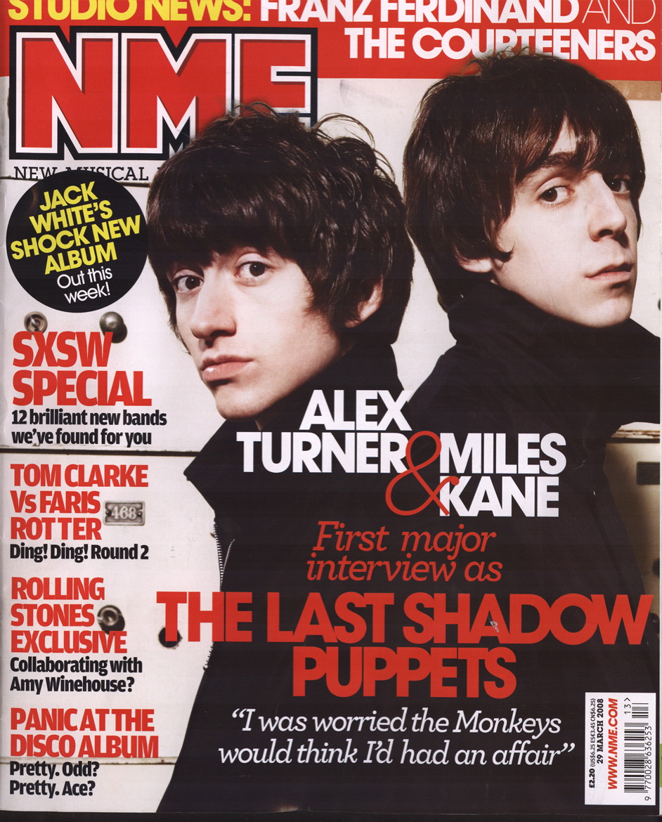
masthead. The masthead is the main banner/logo, normally placed at the top left of the front cover (so that when placed in a magazine rack, it can easily be spotted and recognised). The masthead helps portray many aspects of LIIAR: for example, it helps show the institution (i.e. the NME Magazine masthead lets you know, by use of the logo, that the magazine has been made by NME.) It can also be used to attract certain members of the target audience, (e.g. if a magazine is aimed at female audience they may want to give the masthead a conventionally feminine feel to it to attract the chosen target audience.)

Another convention of magazines are cover lines. A cover line is a small heading which outlines the content of a particular article. They are normally very catchy, snappy, short; often get straight to the point and are used to attract members of the chosen audience as well as being able to portray certain aspects of the magazine's ideology (they briefly display what a magazine is about.) The Main Cover Line is the largest, boldest cover line which stands out above the rest of the normal ones. This is normally centering on the main article of feature of the magazine, so in a music magazine it would feature, for example, the most famous musical act featuring in the article. It also displays an article which would be of major interest to most of its target audience therefore attracting more people to buy the magazine. The main cover line normally relates to the main image on the front cover.

The Main Image is the largest image which takes up the majority of space on the front cover. This mostly relates to the main cover line and conventionally, contains the most famous person/musical act to appear in the magazine. In the main image, the person contained is normally represented as being very attractive and confident. This is because they want to put across the idea that the person who makes up this magazine is confident/successful/attractive/powerful, therefore boosting the magazines credentials.

As well as the single main image, throughout most magazines are many Secondary (or sometimes just normal) Images. These images are not as important as the main image, but still hold importance in the context in which they are placed. For example, if a secondary image on the front cover is placed next to a cover line, then chances are it will relate to that cover line. Similarly, images placed on the same double page spread as certain articles, will most probably be related to that specific article.

When regarding Colours used in a magazine, it is clear that colours are used to appeal to their Target Audiences. For example, a 'Gothic' music magazine, will most likely have a much darker colour scheme when compared with a popular music magazine. However, a colour scheme used a lot in magazines (such as NME Magazine,) due to the colours complimenting each other very well, is red, black and white. I will consider how the colours (such as the three aforementioned ones,) I use on my magazine will compliment each other and appeal to my target market, and also how they reflect the ideology of the magazine.

The Bar code is only important to the magazine when regarding the more 'behind-the-scenes' aspects of making/distributing/selling it. While not important to the consumer, the bar code shows that the magazine itself is a commercial item and is only really important to the people and companies who make, supply, buy and sell the magazines (i.e. it is used in the shops to scan the price).

As stated above, a magazine is a commercial item. This means that it is made to be sold to the consumers and make money, meaning that the magazine has to have a Cover Price. The cover price is always priced depending on the size of the target market (and in some cases can dictate the exclusiveness of a magazine's target audience). For example 'Kerrang!' Magazine, is a lot cheaper than 'Vogue' Magazine, meaning that 'Vogue' has a much smaller target market, and although the market of 'Kerrang!' is smaller than that a lot of other magazines, due to the content in 'Vogue' being a lot less mainstream that that of 'Kerrang!', (therefore it is sold to a much more exclusive audience,) it is a lot more expensive than 'Kerrang!'. This shows how Cover price is dictated by and can dictate many aspects of the Target Audience (such as the size of the audience).

Tag-Line's are short, snappy, catchy and positively-themed slogans normally placed near (i.e. just under,) the masthead in most magazines. They are normally relevant to the ideology and content of the magazine, and sometimes incorporate literary techniques such as alliteration and assonance (repetition of the vowel sound,) to make them sound catchy and have an appealing rhythm to them.

Practically all magazines contain Articles. The content of the articles can reflect/influence many aspects of LIIAR, (for example the bands featured can appeal to certain audiences, represent people in certain ways, and also give hints as to the magazine's ideology. The articles themselves has many of their own smaller conventions, such as headlines, quotes from the article, images and smaller headlines or sub-headings, even.

The Contents List of a magazine is found after the front cover and contains a list of articles in the magazine and several images to go with them. They are normally divided in to two sections (and will be in my magazine,) labelled 'Features' (featuring the regular features of the magazine) and 'Specials' featuring one-off features of the magazine (such as a one-off interview with an upcoming band).

All of these conventions can be applied to Music Magazines (as has been mentioned) just by relating the finer content of them to music (such as having articles about a musical act and not just anything.)

I will consider all of these points and conventions when making my magazine.

Friday, 6 November 2009

LIIAR


  • L - Language - The different aspects of the Media text, which combine as a whole to make the text what it is, and put across different aspects, such as Ideology, Institution, Representation and can also be used to attract the target Audience.

  • I - Institution - The industries and companies/agencies who create the media texts (i.e. Kerrang is an institution which makes a music magazine.) All other aspects of LIIAR will be based on the stance of the Institution.

  • I - Ideology - The beliefs and views held by the Institution and more often than not, the target audience which they try to communicate to the consumer. The Ideology will be conveyed through the Language of the Text, (for example, a magazine made my an institution in support of independent bands/musicians, would only feature independent bands/musicians.)

  • A - Audience - The target audience at whom the media text is aimed. Each magazine would adapt other aspects and conventions (or even break them sometimes) to try and appeal to the desired audience.

  • R - Representation - How the Media texts represents different aspects (normally the ideology,) and how they are put across by the text itself. For example, if a magazine wanted to represent a certain individual in a negative way, they would have a photo which makes them appear bad (drunk, for example,) and then have a derogatory headline coupled with the photo.

Main Task

  • Main Task:
  • The front page, contents page and double page spread of a new music magazine.
  • All images and text used must be original, produced by you - minimum of four images.

Friday, 23 October 2009

College Magazine Project Evaluation

For this project, I have been asked to research the conventions of College Magazines and how College Magazines use and adapt these conventions to suit their own needs (i.e. attract their desired audiences) and then to make a front cover of a College Magazine and a mock-up of a contents page. Using the knowledge I have gained during the aforementioned research. I have been presenting my research, planning and designing in the form of an online blog which can be found at http://www.adam-amini-media.blogspot.com/ and which I have been adding to and actively updating throughout the course of the project.

I will now be writing about how I approached each stage of the project and how I feel it went and how I feel the final college magazine has turned out. I will then evaluate the project as a whole, stating what I feel went well and what I would change were I given the chance to undergo the project again.

I initially approached the task by listing the conventions of a College Magazine and how College Magazines use these conventions to serve their purpose (for example, evoke interest in their target audience). This was very useful as it allowed me to recognise the conventions even easier when it came down to analysing magazines, so when I finally began to make it, I could adapt them even easier to suit my own needs.

I then began to conduct research. I did this by looking at existing college magazine covers and contents pages and analysing them and how they use and adapt conventions to suit their own needs. I didn’t just looked at College Magazines, however and I also looked at magazines which were modern and which broke conventions to suit their needs (i.e. the Kerrang contents page which ordered the list of articles by category not page number. This made the contents page seem more interesting and dynamic and had I made a full contents page (and not just the mock-up) I would have used a similar method to this in my own article list.

By looking at other magazines aimed at people aged 16-19 years old, I was able to get an idea of how to use certain conventions (such as the masthead) in an advantageous manner. The reason I looked at magazines aimed at this age range is because they are the ages of most people who attend college and therefore the people who will consume the magazine, so it makes sense for research to be conducted on magazines aimed at the age group.

After research I made decisions on certain aspects of my magazine (such as the layout, content of the photographs and stories featured). A lot of these decisions were made to appeal to a young, gender-neutral audience (so both males and females). I then hand-drew draughts of the cover and contents page so that I could get a basic idea of what they will be like. These draughts were then the basis for my first IT draughts and finally, the finished Cover and Contents Page.

I took my own Medium Close-Up photographs (and more for the contents page (i.e. the photograph of books and a person using the laptop) and I then edited them as appropriate using the easy to use and accessible programme, Paint Shop Pro 9. When regarding editing, I mainly cropped the photographs to suit the needs of the magazine lay-out, but in the case of the picture of the laptop user, I also created feelings (in this case, the implication of stress) by using the Paint Shop Pro features of a ‘Zoom Blur’ and the ‘Hue’ of the image.

I used Paint Shop Pro 9 to make the final copies of the magazine as the software is both easy to use and the functions suited my purpose (i.e. editing photos, text placement, different fonts and text colours to name a few). I also could save the files as a .PSPImage so that I could resume editing at a later date, and then finally save the file as a .Jpeg which allowed it to be uploaded to the blog.

I am very please with the outcome of the Front Cover, as I believe I adapted conventions (such as the masthead, main photograph and cover lines,) to appeal to the target audience and put across the ideology of the magazine (‘Wyke Lyfe’ about the social life of students at Wyke College.) I am very pleased with the Masthead and I like the way that the text (red and black) and the font combine to give the masthead a strikingly appealing and modern appearance. I also believe that the breaks in the font which allow for some of the yellow background to be seen, give it the appearance of graffiti, which even further reflects the younger audience (and how they like to do things such as make graffiti to be ‘rebellious’.) I am also pleased with how the Main Cover Line appeals to the younger audience as whole, as many people in the age range of the magazine go to Nightclubs and the fact that it is about an ‘Under-18’s’ night allows even the people who are too young to go to nightclubs to be interested.

The contents page, while dynamic in terms of layout (if fully made the articles would be listed in a similar, non-ordered way as seen in the Kerrang Magazine,) in my opinion was too conventional in terms of layout. This is because it was very similar to most other normal, plain and boring magazines in the way that it has the normal title and a very conventional layout. If I were to undergo the project again I would most certainly make the contents page more dynamic and appropriate for a younger, more exciting audience.

Overall, I believe that the project went well; I managed to perform sufficient research and apply conventions to my magazine and adapt them in such a manner as to appeal to my target audience (moder styling and colours for example) and I also adapted them to suit the ideology of my magazine (the ‘Social Saviour’ as the selling line stated). I believe that I utilized different software (e.g. the Blogger software and Paint Shop Pro 9) in an efficient manner and was quite successful in completing the required task.

If I were to change anything about my final project I would probably adapt the conventions used in the contents page in a more modern and interesting manner (to appeal to my target audience) as I believe the contents page I produced is quite bland and not particularly appealing to people in the 16-18 age range.

Wednesday, 21 October 2009

Contents Page Draught - 02 (Made in Paint Shop Pro 9)


This is the first ICT draught of my Contents Page. Though it is unfinished, the main purpose of it was to determine differnt ways I could present the layout of the magazine, determine the positives and negatives of it and then change it appropriately for my final draught.

On the one hand, I am pleased with how I have used conventions easily. For example, there are pictures relating to the articles with text undereath and the use of pictures will create interest ad engage the reader even further into the magazine.

It is conventional in the sense that there is a list of articles, which wouild be easily accessible and help the reader locate specific articles of interest.

On the other hand, I believe the fact that I have pretty much stuck to the conventions has made it boring and I would like to, in the final draught of the mock-up, create a more dynamic and interesting, less conventional contents page, which I believe would be of more interest to the younger audience (16-18/19 years old) at whom my magazine is aimed. An example of how I have stuck to conventions is the linear and even boring layout of the list of articles.

Front Cover Draught - 02 (Made in Paint Shop Pro 9)


This is the first draught of my magazine front cover which has been made on a computer (more specifically, on Paint Shop Pro 9)

I am pleased with the outcome, though there are many things which I would like to improve, yet there are also many positive points, i.e. the ways in which I have adapted conventions to suit my needs.

For example, the Masthead (even though part of it is covered by the MCU) includes the boldest and most 'eye-catching' text on the page, followed by the Main Cover Line (HPV Exclusive) and then the next two cover lines which would only probably be read when initial interest has been taken. I do think that in my Final Draught I will probably have a more gender-neutral Main Cover Line, as i believe this magazine seems more aimed at a female audience.

There is no bar code on the draught and there will not be on the final magazine. This is because the magazine is given out free to people at the college, and as a sale isn't being made, there is no need for a bar code.

I will also probably give the text a more modern and 'cool' look, so as to appeal more to the younger audience, as I believe the current scheme, though eye catching, is quite boring.

There is also the issue number in the bottom corner. Although issue numbers are normally used for filing and keeping records, this probably would be more useful for the college and not the people who consume the magazine, as they may want to keep a record of the issues for purposes such as seeing how the magazine has come along since it was first created.

I am also pleased with the selling line (Your Social Saviour) as it related the magazine you the reader (by use of the word YOUR) and Social Saviour is alliteration, which makes it more catchy and snappy and appeals more to the target audience.

Photographs Taken


These are three examples of the photos I have now taken to use in the magazine.

Though at the most, only around four photographs will be used I have taken a wider range so that I have a lot to choose from while making the magazine front cover/contents page.

As you can see I have taken the required medium close-up and have also taken other photos relating to the magazine (books, student using laptop) and the photos will be cropped/edited as needed.

For example, to go by the convention of a person on the front of a magazine obscuring part of the title, the Medium Close-Up would need to be cropped so that there is less empty space in the image.

I used a wide range of photographic skills to produce the desired outcome in these photographs (for example, to take the picture of the books with acceptable detail and focus I used the Macro function of the camera, and while taking the Medium Close Up I had to consider the clothes the subject was wearing and how they were complimented by the colour of the background and the lighting of the area in which the photograph was taken, in this case, outdoor lighting on an overcast day.)

Monday, 19 October 2009

Contents Page Draught - 01

Front Cover Draught - 01

Magazine Title Ideas - Brainstorm and Decision


Here are the brainstorms I made when regarding the title of my magazine.

I am very pleased with my chosen title as I believe it sum up the ideology of my magazine (being about the college social life) in a modern and eye-catching manner.