[Image found at http://www.pressherepresents.com/wp-content/uploads/2008/04/nme-front-cover-29308.jpg]
I will now analyse this particular 'NME' Front Cover.
When regarding the Media Language, the front cover follows many conventions and uses them for it's own need, for example:
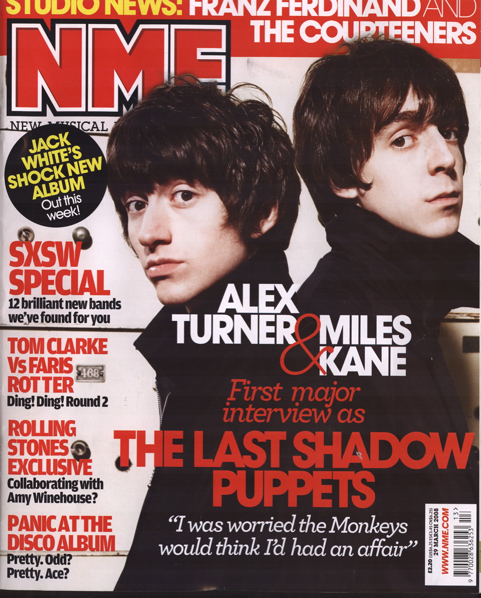
- The Masthead is in the top left hand corner (so that it is clearly visible when placed on a full magazine rack) and consists of the conventional colour scheme of red, white and black (as does the rest of the front cover, and believe this is a very good aesthetically pleasing colour scheme).
- The masthead contaisn the text NME, which is the naem of the magazine, and as written below, stands for New Musical Entertainment. This also reflects the ideology of NME, which is that they want to show the newest music in the entertainment business.
- The Main Image of the front cover shows two male models who are part of a new musical act. They are both represented in a positive way (they look confident and even the clothes they are wearing seem well-made and of high quality, implying that they are rich) and they seem 'cool' in the way that the main audience of their genre of music (indie, in this case) would perceive 'cool' to be. Even their facial expression seems very confident which is shown by the fact that they are looking directly at the camera and the man on th right is looking slightly upwards, almost as if he is raising himself above others importance-wise.
- As the Magazine is a commercial procuct, it has a Cover Price and a Barcode. They are both situated in the bottom right hand corner and are very small so that they do not take up an awful lot of cover space, as they are not important to the consumer, so do not need to be noticed. The Magazine costs only £2.20 which, while more expensive compared to some magaines, is actually quite cheap. This is because the audience of NME is not very exclusive (as they cover a wide range of rock sub-genres and sometimes not even rock in the magazine, so its content appeals to many), this is unliek some of the more expensive and exclusive magazines, such as Vogue.
- The Main Cover Line ("Alex Turner... first interview... '...had an affair'") is related directly to the Main Image, as this is the main story featuring in the magazine, and therefore the one which will attract the most potential buyers, so the one they will advertise the most and the content of the story (a new band's first interview,) fits in with the NME Ideology (it's all about new music).
- The rest of the Cover Lines are all about musical acts which, though not exactly new (i.e. The Rolling Stones) all are parts of the main genre of music NME displays (indie/punk/soft rock). One fo the cover lines fits directly with the ideology as it says: "12 new bands we've foudn for you", and they are also in text which is red and black and therefore fits in with the conventional colour scheme.
- In the section with the barcode, more aspects of the NME institution has been shown, because it shows their website adress: www.NME.com. Upon going on the website, it is clear that it carries many similar aspects to the magazine, (colour scheme, content based around new music and representing the artists as conventionally 'cool'.)
No comments:
Post a Comment