Wednesday, 9 December 2009

Front Cover Textual Analysis 03


[Image from: http://www.getloadedinthepark.com/images/news/209/DJ%20Magazine%20-%20July%2009.jpg]

'DJ Magazine' (shortened to 'DJ Mag in the masthead') is a monthly U.K. Magazine, dedicated to Electronic Dance Music. I have chosen to analyse this front cover because the magazine has a different musical genre in the ideology when compared to the other two I have chosen. This means that there will be more variation in my research.
  • The masthead (almost entirely blocked out by the main image, showing only the word 'DJ',) consists of the conventional colour scheme of red, black and white. Unlike the other front covers I have looked at, this one has more aspects of the institution in the masthead (despite the name of the magazine/company) as it has the website on the side, instead of in the bar code. This is good, as people who mostly use the Internet may have hard of the website and not the magazine, so they will recognise the magazine from the web address, and, if a person doesn't buy the magazine, but are still interested, they can go on the website increasing their chances of returning and purchasing it.
  • The main image features two male models, both making eye contact with the camera, who are posing with the prop (sunglasses) in such a manner that they appear confident. Their clothing is representative of what the target audience of the magazine think of as 'cool', (differing from clothing featured on the Kerrang! and NME front covers, as the target audiences like different genres of music, so will prefer different fashion styles). The brighter colours on their clothing choices are more reminiscent of the upbeat, happy-sounding dance music featured in the magazine.
  • The main cover line (red, black and white colouring,) is related to the musical act in the main image, and the normal cover lines are all relative to other musical acts of the same/similar genre. They are relating to acts well known on that music scene, but they may not be well known to other people, that is why the main image and cover line stands out very well, as they need to be noticed by the intended audience.
  • There is a bar code and price, (as it's a commercial product,) the price being slightly more expensive than the other magazines analysed, as the magazine has a slightly smaller target audience.
  • They also advertise free items with the magazine. This is clever as it would entice people in to buying the magazine for the free remix song, especially if they are interested in the musical act who made it.
  • It also contains information about festivals and live music, which, it being a dance-music magazine, will be important in the ideology (such as live DJ music in nightclubs), so it will be an important aspect of the ideology.

Front Cover Textual Analysis 02

[Image found at: http://specials.centurymedia.de/myspace/lc_cover.jpg]

This is the front cover of an issue of 'Kerrang!' magazine. This cover is particularly interesting, as it breaks away from what is normally expected of Kerrang!, making the cover more interesting, yet also keeps some of the original elements expected from the magazine, meaning that it still appeals to the main target audience of Kerrang!.

  • The first notable difference of this issue of Kerrang! magazine when compared to most others is the fact that they have abandoned their normal colour scheme (consisting of a very bright yellow masthead, with black and less conventional colours throughout,) replacing it with the conventional music magazine colour scheme of Red, Black and White. This gives the magazine a more 'high-class' feel when compared with most other issues of Kerrang!.

  • The magazine still manages to keep Kerrang!'s alternate, even 'anarchistic' (almost), feel to it, mainly by use of the font in the masthead. Placed, conventionally, in the top left hand corner, the masthead breaks Kerrang! tradition in the fact that the masthead is white and not one of the more alternative colours Kerrang! normally adopts (such as the bold yellow). This makes the masthead, just the colour scheme, seem more 'high-class'. The font however, is given an almost destructed look, (e.g. the edges seem chipped almost, and the font almost has the look of broken glass (connoting violence and even vandalism which are all somewhat negative association with the classical rock and roll music Kerrang! became associated with).

  • The colour scheme itself (with the almost 'high-class' look) was, I believe incorporated into this specific issue of Kerrang! to fit in with the look of the main image, which in itself breaks many of the conventions of Kerrang!.

  • The first way in which it does this is because the model is female, which isn't incredibly common in music magazine front covers today. This appeals to male audiences, because she is depicted as being very attractive and in the fact that she seems very confident (slight smile, eye contact with the camera,) female audiences would like this as they are showing her as very confident and strong.

  • The shot is a medium close up (it shoes from the shoulders upwards,) and this, combined with her appearance , (the make up and black clothes) comes across as the sort of image you would expect on the front of a fashion or beauty magazine (such as vogue) and not what you would expect on Kerrang!. However, the fact that she is wearing black with the black make up and black hair, show that the almost Gothic image is being upheld.

  • This would attract more female audiences as well, because it is reminiscent of magazines aimed at them. Also, while she may not be well known to a lot of people, to the particular audience of Kerrang! she will be very well known, which is why it is her dominating the front cover, and not other, more well known bands.

  • This fact has however been considered because one of the secondary images is of a band called 'Green Day' who are a lot more well known in the U.K. This means that the secondary image will attract more people to buy the magazine, even if the main image does not. The other secondary image contains a picture of a live performance, which is a lot more typical of Kerrang! than some of the other elements.

  • The main cover line relates directly directly to the main image as it is about the band in which she is the lead singer. It also refers to her as a "Metal Goddess", which, like the main image, keeps Kerrang!'s image (of a Metal magazine,) while having a non-typical portrayal of her, similar to that of a beauty magazine (describing her as a Goddess).

  • Being a commercial product the magazine has a price and a bar code. The price of the magazine is around £2.50-£3.00. This is because the magazine is not very exclusive, as it caters for a wide range of people, but due to the specific nature of the music it features the price is slightly more than that of other magazines (such as television magazines, for instance,) which are consumed on a much larger scale.

  • The rest of the cover lines, and the box and border around one of the secondary images all follow the red/black/white colour scheme, which I believe is very pleasing on the eyes and gives the magazine a very modern and more mainstream look, while still managing to please the target audience by sticking to the conventions Kerrang! upholds.

  • There is also reference to the website and television channel near the bar code, which shows a lot more about the different institutions which make up Kerrang!, and shows how successful it is (as it has a website, radio station, television station and a magazine).

Front Cover Textual Analysis 01


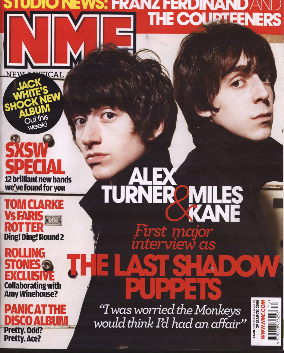
[Image found at http://www.pressherepresents.com/wp-content/uploads/2008/04/nme-front-cover-29308.jpg]


I will now analyse this particular 'NME' Front Cover.

When regarding the Media Language, the front cover follows many conventions and uses them for it's own need, for example:
  • The Masthead is in the top left hand corner (so that it is clearly visible when placed on a full magazine rack) and consists of the conventional colour scheme of red, white and black (as does the rest of the front cover, and believe this is a very good aesthetically pleasing colour scheme).
  • The masthead contaisn the text NME, which is the naem of the magazine, and as written below, stands for New Musical Entertainment. This also reflects the ideology of NME, which is that they want to show the newest music in the entertainment business.
  • The Main Image of the front cover shows two male models who are part of a new musical act. They are both represented in a positive way (they look confident and even the clothes they are wearing seem well-made and of high quality, implying that they are rich) and they seem 'cool' in the way that the main audience of their genre of music (indie, in this case) would perceive 'cool' to be. Even their facial expression seems very confident which is shown by the fact that they are looking directly at the camera and the man on th right is looking slightly upwards, almost as if he is raising himself above others importance-wise.
  • As the Magazine is a commercial procuct, it has a Cover Price and a Barcode. They are both situated in the bottom right hand corner and are very small so that they do not take up an awful lot of cover space, as they are not important to the consumer, so do not need to be noticed. The Magazine costs only £2.20 which, while more expensive compared to some magaines, is actually quite cheap. This is because the audience of NME is not very exclusive (as they cover a wide range of rock sub-genres and sometimes not even rock in the magazine, so its content appeals to many), this is unliek some of the more expensive and exclusive magazines, such as Vogue.
  • The Main Cover Line ("Alex Turner... first interview... '...had an affair'") is related directly to the Main Image, as this is the main story featuring in the magazine, and therefore the one which will attract the most potential buyers, so the one they will advertise the most and the content of the story (a new band's first interview,) fits in with the NME Ideology (it's all about new music).
  • The rest of the Cover Lines are all about musical acts which, though not exactly new (i.e. The Rolling Stones) all are parts of the main genre of music NME displays (indie/punk/soft rock). One fo the cover lines fits directly with the ideology as it says: "12 new bands we've foudn for you", and they are also in text which is red and black and therefore fits in with the conventional colour scheme.
  • In the section with the barcode, more aspects of the NME institution has been shown, because it shows their website adress: www.NME.com. Upon going on the website, it is clear that it carries many similar aspects to the magazine, (colour scheme, content based around new music and representing the artists as conventionally 'cool'.)

Music Magazine Conventions Mind Map


This is the mind map of Music Magazine conventions I have made, based on my initial ideas in the conventions post.

I will use the information written down as a basis for the textual analysis I will be performing as part of my research.

Friday, 13 November 2009

Conventions of a Magazine / Conventions of a Music Magazine

Many conventions of Magazines in general are just how each magazine uses and adapts certain examples of Media Language to suit the needs of the particular magazine.

For example, one main magazine convention is the masthead. The masthead is the main banner/logo, normally placed at the top left of the front cover (so that when placed in a magazine rack, it can easily be spotted and recognised). The masthead helps portray many aspects of LIIAR: for example, it helps show the institution (i.e. the NME Magazine masthead lets you know, by use of the logo, that the magazine has been made by NME.) It can also be used to attract certain members of the target audience, (e.g. if a magazine is aimed at female audience they may want to give the masthead a conventionally feminine feel to it to attract the chosen target audience.)

Another convention of magazines are cover lines. A cover line is a small heading which outlines the content of a particular article. They are normally very catchy, snappy, short; often get straight to the point and are used to attract members of the chosen audience as well as being able to portray certain aspects of the magazine's ideology (they briefly display what a magazine is about.) The Main Cover Line is the largest, boldest cover line which stands out above the rest of the normal ones. This is normally centering on the main article of feature of the magazine, so in a music magazine it would feature, for example, the most famous musical act featuring in the article. It also displays an article which would be of major interest to most of its target audience therefore attracting more people to buy the magazine. The main cover line normally relates to the main image on the front cover.

The Main Image is the largest image which takes up the majority of space on the front cover. This mostly relates to the main cover line and conventionally, contains the most famous person/musical act to appear in the magazine. In the main image, the person contained is normally represented as being very attractive and confident. This is because they want to put across the idea that the person who makes up this magazine is confident/successful/attractive/powerful, therefore boosting the magazines credentials.

As well as the single main image, throughout most magazines are many Secondary (or sometimes just normal) Images. These images are not as important as the main image, but still hold importance in the context in which they are placed. For example, if a secondary image on the front cover is placed next to a cover line, then chances are it will relate to that cover line. Similarly, images placed on the same double page spread as certain articles, will most probably be related to that specific article.

When regarding Colours used in a magazine, it is clear that colours are used to appeal to their Target Audiences. For example, a 'Gothic' music magazine, will most likely have a much darker colour scheme when compared with a popular music magazine. However, a colour scheme used a lot in magazines (such as NME Magazine,) due to the colours complimenting each other very well, is red, black and white. I will consider how the colours (such as the three aforementioned ones,) I use on my magazine will compliment each other and appeal to my target market, and also how they reflect the ideology of the magazine.

The Bar code is only important to the magazine when regarding the more 'behind-the-scenes' aspects of making/distributing/selling it. While not important to the consumer, the bar code shows that the magazine itself is a commercial item and is only really important to the people and companies who make, supply, buy and sell the magazines (i.e. it is used in the shops to scan the price).

As stated above, a magazine is a commercial item. This means that it is made to be sold to the consumers and make money, meaning that the magazine has to have a Cover Price. The cover price is always priced depending on the size of the target market (and in some cases can dictate the exclusiveness of a magazine's target audience). For example 'Kerrang!' Magazine, is a lot cheaper than 'Vogue' Magazine, meaning that 'Vogue' has a much smaller target market, and although the market of 'Kerrang!' is smaller than that a lot of other magazines, due to the content in 'Vogue' being a lot less mainstream that that of 'Kerrang!', (therefore it is sold to a much more exclusive audience,) it is a lot more expensive than 'Kerrang!'. This shows how Cover price is dictated by and can dictate many aspects of the Target Audience (such as the size of the audience).

Tag-Line's are short, snappy, catchy and positively-themed slogans normally placed near (i.e. just under,) the masthead in most magazines. They are normally relevant to the ideology and content of the magazine, and sometimes incorporate literary techniques such as alliteration and assonance (repetition of the vowel sound,) to make them sound catchy and have an appealing rhythm to them.

Practically all magazines contain Articles. The content of the articles can reflect/influence many aspects of LIIAR, (for example the bands featured can appeal to certain audiences, represent people in certain ways, and also give hints as to the magazine's ideology. The articles themselves has many of their own smaller conventions, such as headlines, quotes from the article, images and smaller headlines or sub-headings, even.

The Contents List of a magazine is found after the front cover and contains a list of articles in the magazine and several images to go with them. They are normally divided in to two sections (and will be in my magazine,) labelled 'Features' (featuring the regular features of the magazine) and 'Specials' featuring one-off features of the magazine (such as a one-off interview with an upcoming band).

All of these conventions can be applied to Music Magazines (as has been mentioned) just by relating the finer content of them to music (such as having articles about a musical act and not just anything.)

I will consider all of these points and conventions when making my magazine.

Friday, 6 November 2009

LIIAR


  • L - Language - The different aspects of the Media text, which combine as a whole to make the text what it is, and put across different aspects, such as Ideology, Institution, Representation and can also be used to attract the target Audience.

  • I - Institution - The industries and companies/agencies who create the media texts (i.e. Kerrang is an institution which makes a music magazine.) All other aspects of LIIAR will be based on the stance of the Institution.

  • I - Ideology - The beliefs and views held by the Institution and more often than not, the target audience which they try to communicate to the consumer. The Ideology will be conveyed through the Language of the Text, (for example, a magazine made my an institution in support of independent bands/musicians, would only feature independent bands/musicians.)

  • A - Audience - The target audience at whom the media text is aimed. Each magazine would adapt other aspects and conventions (or even break them sometimes) to try and appeal to the desired audience.

  • R - Representation - How the Media texts represents different aspects (normally the ideology,) and how they are put across by the text itself. For example, if a magazine wanted to represent a certain individual in a negative way, they would have a photo which makes them appear bad (drunk, for example,) and then have a derogatory headline coupled with the photo.

Main Task

  • Main Task:
  • The front page, contents page and double page spread of a new music magazine.
  • All images and text used must be original, produced by you - minimum of four images.